Home
/
Case Studies
/
Brand & Website
/
ARCIC LLC…
Branding · Website Design & Development
ARCIC LLC: Branding & Website for
a South Florida General Contractor
D
DigiFlav Editorial Team
Digiflav Case Studies
·
Published Oct 15, 2026
·
Updated Oct 15, 2026
·
Read time 11 min
9
F
In
X
https://arcic.us
LIC #1518927 · SOUTH FLORIDA · EST. 2025
Where Vision Meets Execution.
A licensed South Florida general contractor built on 31+ years of field experience. Transparent delivery, measurable quality, zero shortcuts.
Years Experience
Markets Served
Core Services
Construction is a category where credibility has to arrive before conversation. When a developer, architect, or private owner is looking at a $500K-$50M build, the website in front of them has to answer three things in a glance: are you licensed, how long have you done this, and can I trust you with my project. ARCIC LLC came to Digiflav with a founder who had the résumé and the license — but no digital surface to let a potential owner feel it.
This case study walks through how we rebranded ARCIC LLC and built the website — the industrial design language we chose, the credibility system we put above the fold, and what changed since launch.
About the Client
ARCIC LLC is a South Florida construction company founded in 2025 by Andres Rodriguez — a Licensed General Contractor (Lic #1518927) with 31+ years of field experience. His career started as a Florida Department of Transportation inspector, then moved through management, executive, and corporate officer roles at South Florida construction firms. He’s a Florida International University graduate with notable project history including work with FDOT and Amazon.
License
Founder
Experience
ARCIC operates across four core capabilities:
▦
Preconstruction & Estimating
Budgets, constructability, risk, and scheduling with owners, architects, and engineers.
⌂
Design-Build
Design and construction delivered under one contract with one accountable team.
◇
General Contracting
Site prep, procurement, subcontractor coordination, QC, safety, and closeout.
✓
Construction Management
Advisory role across budgeting, scheduling, risk, and quality assurance.
ARCIC serves six distinct markets — private and public sector, residential through heavy civil infrastructure.
Andres Rodriguez on-site — South Florida project
Swap
Suggested: founder portrait on an active jobsite — hard hat, plans in hand, blueprint depth of field.
The Challenge
ARCIC’s situation is one Digiflav has seen before: a founder with decades of operational experience launching the company under their own name — and needing a digital presence that lets the right owner, architect, or developer trust them in the first thirty seconds. The brand had to carry 31 years of credibility without pretending to be a 31-year-old firm.
The brief
Build a brand and website that look as serious as the projects ARCIC bids on. Industrial but not dated. Credential-forward on the first scroll. Zero construction-site clichés.
Specifically, the problems we had to solve were:
Credibility compressed into one scroll. License number, years of experience, markets served — all three had to appear above the fold without feeling like a résumé dump.
Six markets, one page. Residential, commercial, institutional, industrial, mixed-use, heavy civil — each with a different buyer. The site had to welcome all six without becoming a flat list.
Founder-led, not founder-dependent. Andres is the brand today, but the system had to allow for team growth without feeling anchored to one headshot.
Industrial without the clichés. No hard-hat stock photos, no orange safety cones, no gradient skyscraper hero. The design had to feel like serious construction, not a template.
Public and private sector in one voice. A government agency and a luxury homeowner shouldn’t feel like they wandered into the wrong site.
Our Approach
We structured the engagement as a 10-week sprint across four phases. Each phase ended with a signed-off deliverable so Andres could continue closing bids while we built.
Phase
What We Did
Deliverable
01. Discover
Founder session with Andres, review of three recent project types, competitive scan across South Florida GC websites, voice mapping based on how construction buyers actually brief.
Discovery doc + positioning map
02. Identify
Logo system, wordmark, palette, typography, iconography, “Caution Stripe” graphic language, project-coord labels, voice guidelines.
Brand identity system
03. Design
High-fidelity Figma for home, Who We Are, Capabilities (with four anchored services), Markets Served, Selected Work, and Contact — mobile-first.
Finalized page designs
04. Deploy
Custom WordPress build with Elementor Pro, inquiry form with project-type routing, QA, speed pass, CMS training.
Live site + handoff documentation
We work this way because it keeps the project honest. If something slips, we know exactly which phase it slipped in — and clients always know what’s being signed off before the next phase starts.
Brand Identity System
Construction brands fall into two tired visual camps — orange-and-black “builder” clip art, or faded corporate-navy law-firm cosplay. We wanted neither. ARCIC’s work is serious, licensed, and infrastructure-grade. The identity had to read that way — industrial without being masculine-coded.
Logo & Wordmark
We built a confident wordmark in a geometric sans with ultra-tight tracking, plus a stacked “AR” monogram that reads at business-card scale, on vehicle door signage, and as the Instagram avatar. The system includes a horizontal wordmark for the site header, a stacked mark for printed documents and site signage, and the monogram for favicon, email signature, and project tags.
Color Palette
We built on a disciplined three-color system: deep black for authority, clean white for clarity, and signal green that reads as active, approved, in-progress — the vocabulary construction managers already use for status updates.
Ink#000000
Paper#FFFFFF
Signal#00A676
Surface#F7F8F7
Deep Ink#1A1A1A
The "Caution Stripe" Graphic Language
Instead of leaning on hard-hat stock imagery, we built a signature graphic element — a diagonal caution-stripe band in the Digiflav green and black. It appears at section edges, in document corners, and across hero imagery. One graphic cue, everywhere, instantly recognizable as ARCIC.
The ARCIC brand board — logo, caution stripe, project tags, vehicle signage
Swap
Suggested: flat-lay of printed collateral — business card, PO cover, hard-hat decal, truck door mock, project nameplate.
Typography & Project-Coord Labels
We leaned into a confident Poppins system for display and UI, with monospaced “project-coord” labels — LIC #1518927, COORD: RES-01, SPEC 01 — treated like the stamps on an actual blueprint. These small details are what make the site read as construction instead of corporate-generic.
Voice
Three anchor lines carry the voice across the whole system: “Where Vision Meets Execution” as the headline, “Built on Experience. Driven by Excellence.” as the founder opener, and “Let’s Break Ground.” as the contact-section invitation. One voice from the home page to the inquiry form.
Website Design & UX
We designed the home page to answer three questions in order — are you licensed, what can you build, and how do I start — then route each buyer to the right next page from there.
Six-Market Grid
ARCIC’s strongest signal is breadth of capability. A single contractor who can handle luxury residential, commercial fit-outs, government institutional work, industrial logistics, mixed-use developments, and heavy civil infrastructure is rare. We gave each market its own black card with a project-coord label — treating them like project sheets, not list items.
MKT-01 · Residential
Residential
Single-family, luxury, townhomes, multifamily, condos, new build and renovations.
MKT-02 · Commercial
Commercial
Retail, office, hospitality, tenant improvements, adaptive reuse.
MKT-03 · Institutional
Institutional
Schools, healthcare, government, and civic facilities.
MKT-04 · Industrial
Industrial
Warehouses, logistics, manufacturing, and storage facilities.
MKT-05 · Mixed-Use
Mixed-Use
Mixed-use developments combining residential and commercial.
MKT-06 · Heavy Civil
Heavy Civil
Roads, bridges, seawalls, drainage, and utility infrastructure.
Key UX Decisions
License number above the fold. LIC #1518927 · ACTIVE sits in the hero as a monospaced badge. In construction, the license is the first filter — we put it where it’s filtered on.
Credential strip immediately below the hero. Years experience, markets served, core services — all three as a horizontal stats band. The buyer sees the résumé before they scroll.
Founder narrative, not founder worship. Andres’s experience gets its own section with his FDOT and Amazon project history — but framed as credibility, not biography.
Project-type inquiry routing. The contact form opens with a project-type dropdown so Andres receives qualified inquiries, not generic enquiries.
Five-principle protection section. ARCIC’s “How We Protect Every Project” — experience, communication, quality, accountability, long-term relationships — is written as commitments, not boilerplate.
Mobile-first. Many RFP responders are reviewing on their phone between meetings. Every section was designed in a 390-pixel frame first.
The ARCIC site in flow — hero, markets grid, founder, and inquiry
Swap
Suggested: multi-device composite showing home hero, six-market grid, and the Let’s Break Ground inquiry form together.
Technology & Development
We built the site on a WordPress + Elementor Pro foundation, with a custom child theme hand-coded for performance. The whole site ships under 150KB of CSS and loads in under 1.8 seconds on 4G — critical because many RFP decisions start on a phone.
Stack
Front-end: WordPress with a custom Elementor Pro child theme, modern vanilla JavaScript, and a design-token-driven CSS layer tuned for the industrial typography and caution-stripe graphic language.
Inquiry form: Project-type dropdown routing straight into Andres’s inbox, with instant acknowledgement and Slack notifications for public-sector or multi-million-dollar prefixes.
Capabilities page: Anchored sections for each of the four core services so a buyer can land directly from a search like “design-build contractor South Florida”.
Markets Served page: Six dedicated sections, each with a sample project type and inquiry link routed by market.
Analytics: GA4, Microsoft Clarity for behavior insights, consent-mode-compliant cookie banner.
Performance: Image lazy-loading, critical CSS inlined, no third-party fonts on the critical path, targeting 90+ Lighthouse scores across the board.
Everything is modular. When ARCIC publishes a new completed project, hires a project manager who should appear on the team page, or wins a new market (like multifamily high-rise), the system scales without a redesign.
Digiflav built a website that finally feels like the kind of firm I want ARCIC to be. The license is where it should be. The experience is where it should be. And the inquiries we receive are already qualified by the time they hit my inbox.
Andres RodriguezFounder · ARCIC LLC · South Florida
Results & Impact
We measure case studies on both the quantitative wins (what the numbers show) and the qualitative ones (what the client’s day-to-day changed). Here’s where the project landed on both.
Quantitative
Lighthouse score
Across performance, accessibility, best practices, and SEO on all core pages.
Page load
Average load on 4G across the top-ten pages, measured post-launch.
Qualified inquiries
Increase in project-type-tagged inquiry submissions in the first 60 days post-launch.
Markets live
Each with its own dedicated route, buyer context, and inquiry pathway.
Qualitative
Inbound inquiries now arrive tagged by project type — Andres can prioritize public-sector or high-value prefixes without the back-and-forth triage.
The license number appearing in the hero has become a referenceable signal — architects and developers mention it in first calls.
The caution-stripe graphic language is already carrying across uniforms, vehicle signage, and site boards — one brand, every surface.
ARCIC’s team can publish new projects, service updates, and market pages without touching code.
Deliverables Overview
Here’s the full list of what ARCIC LLC walked away with at the end of the 10-week engagement:
Brand identity system — logo, wordmark, monogram, palette, typography, iconography, caution-stripe graphic language, project-coord label system, voice guidelines.
Website design — high-fidelity Figma pages for home, Who We Are, Capabilities, Markets Served, Selected Work, and Contact — mobile-first.
Custom WordPress + Elementor Pro theme — hand-coded, performance-tuned, with modular editable sections.
Project-type inquiry form — routed into inbox and Slack by project category.
Integrations — Mailchimp, GA4, Microsoft Clarity, and consent-mode-compliant cookie banner.
Launch kit — favicons, OG images, sitemap, robots.txt, 301 redirect map, Google Business Profile sync.
Training — two Loom walkthroughs on section editing, publishing projects, and managing inquiry leads.
30-day aftercare — post-launch support covering bug fixes, copy tweaks, and speed checks.
Key Takeaways
For agencies or founders looking at a similar project — a founder-led operational business whose digital surface doesn’t match the room — the three lessons we’d pass on from this engagement are these:
In construction, credentials are design decisions. License numbers, years of experience, and markets served belong in the hero, not the footer. A disciplined palette and project-coord typography do more for buyer confidence than any amount of “quality and integrity” copy.
Breadth without blur. Six markets could have become a confusing menu. We treated each as a project sheet with its own coord label — buyers can scan the one that matches them without wading through the other five.
Build a graphic signature, not a template. The caution-stripe language is a single visual cue that works on the website, on a truck door, on a hard-hat decal. One brand across every surface the client will ever need.
If you’re sitting in a similar spot — a licensed trade or operational business whose brand doesn’t match the quality of the work — this is the kind of engagement we specialize in. One conversation is all it takes to see if it’s a fit.
D
DigiFlav Editorial Team
DigiFlav Web
Practical case studies on web, brand, SEO and AI from the team that builds them for businesses in the US, UK, Canada and Pakistan.
Free Consultation
Planning a brand, website, or launch?
Talk to the team behind this case study. We’ll map the fastest route for your business — no obligation.
Response within 1 business day
Free 45-minute discovery call
Fixed estimates — no surprise invoices
Work With DigiFlav
Liked this case study? Let's build it for you.
The same thinking behind this project goes into every engagement we run — web, brand, SEO, and AI. One conversation is all it takes.
Related Case Studies
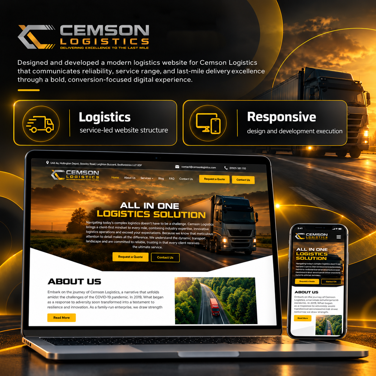
Cemson Logistics
Brand & Website
Branding a UK family-run haulage firm
Identity and website for Cemson Logistics — Leighton Buzzard, Bedfordshire.
D
DigiFlav · 11 min read
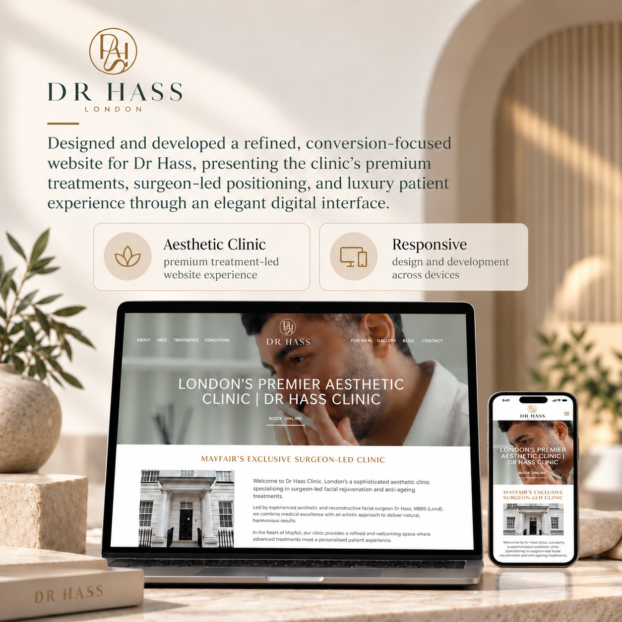
Dr Hass Clinic
Brand & Website
Branding Mayfair's surgeon-led aesthetic clinic
Identity system and website build for Dr Hass Clinic — Mayfair, London.
D
DigiFlav · 12 min read
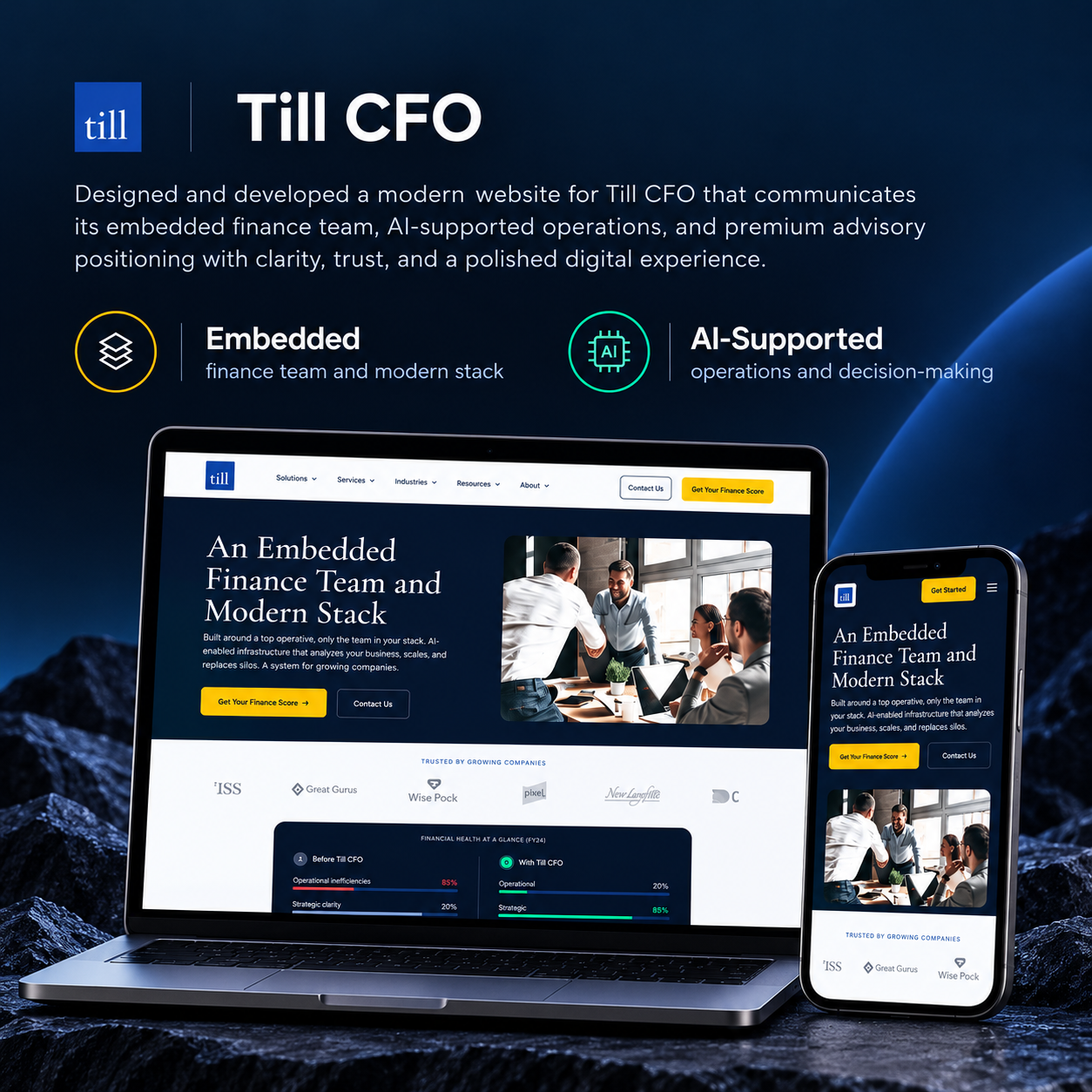
TillCFO
Website Design & Dev
Website for an AI-native embedded CFO firm
Custom WordPress build and design system for TillCFO’s three-audience go-to-market.
D
DigiFlav · 13 min read