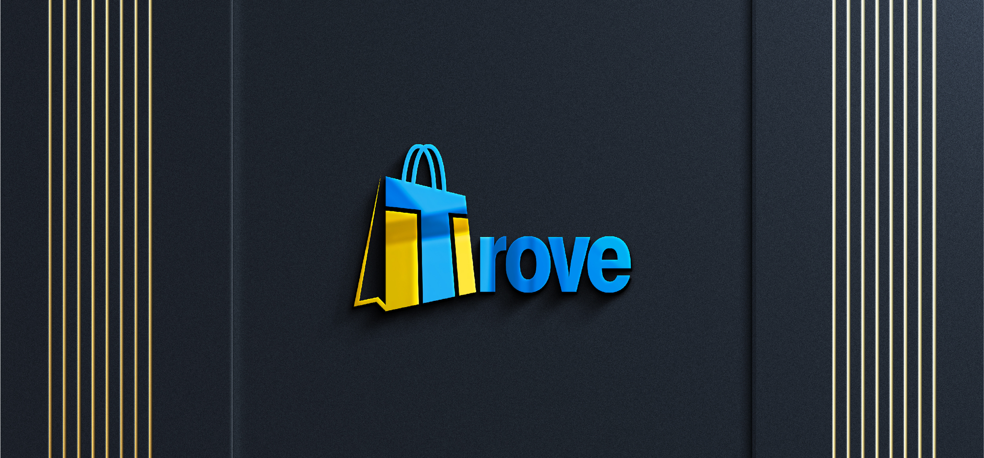
For the launch of “Trove,” a new online retail store, I was tasked with creating a brand identity from the ground up. The client had a powerful name but no preconceived visual direction.
We led the creative process, transforming the definition of “Trove”—a store of valuable or delightful things—into a sophisticated and memorable logo that tells a story of discovery and quality.
The Challenge
The client’s brief was intentionally open: create a logo for a store with over 100 diverse products, similar in spirit to Etsy or a boutique Amazon. The central challenge was to design a brand mark that could represent everything from handcrafted jewelry to tech gadgets without being generic. The logo needed to visually communicate the core promise of the name “Trove”—the excitement of unearthing a treasure—and establish a premium, trustworthy feel for a brand-new marketplace.
My Role & Responsibilities
As the sole Brand & Logo Designer, I was responsible for the entire creative journey, from ideation to final execution. My duties included
Creative Strategy: Interpreting the open-ended brief and proactively proposing a strong initial concept.
Conceptual Development: Exploring various visual metaphors for “treasure,” “value,” and “discovery.”
Logo Design & Execution: Crafting a unique and meaningful logomark and logotype that integrated the brand story.
Brand Systematization: Defining a color palette and typography that would be versatile for a modern e-commerce platform.
Client Collaboration: Guiding the client through the creative process to ensure the final design perfectly aligned with their vision.
Key Deliverables
A complete Logo Suite (Primary, Wordmark, Icon-only versions) Strategic Brand Color Palette (HEX, RGB, CMYK values) Typography Guidelines for web and print Digital Mockups showcasing the logo on a website, app icon, and packaging
The Process & Solution
With a name as evocative as “Trove,” my process was rooted in storytelling.
Defining the Narrative: My journey began with the name itself. I proposed an initial concept where the logo would visually represent a “treasure chest” or “vault.” I envisioned the ‘T’ emerging from a glowing source and the ‘V’ forming the lid of a chest, creating an immediate sense of anticipation and value. The client loved this direction, giving us a strong foundation to build upon.
Exploration & Sketching: While the initial concept was strong, I explored several avenues to ensure we found the best fit. I sketched ideas around keyholes, antique maps, and sparkling gems. This exploration phase confirmed that the original “vault” concept was the most unique and strategically sound, as it could be cleverly integrated into the brand name itself.
Digital Crafting & Refinement: In Adobe Illustrator, I began crafting the logomark. The design solution was to subtly embed the story within the letters. The crossbar of the ‘T’ was shaped to suggest the opening of a vault, with a hint of a glow from within. The ‘V’ was given a slight arch, echoing the lid of a treasure chest. We chose a rich gold hue to exude luxury and a deep charcoal to ground the brand in sophistication.
Creating a Versatile System: A logo for an online store must work everywhere. I meticulously tested the final design for scalability—ensuring it was crisp and clear as a tiny website favicon and impactful on shipping boxes. The final typography was chosen for its clean, modern readability, ensuring a seamless user experience on the retail site.